How to Design Product Packs with Shelf Appeal
It takes a real graphic design nerd to design print-perfect artwork for product packs. And my clients and printers will happily vouch that I am one! I’ve learnt over the years that experience costs clients less in the long run.
Designing artwork for packaging takes 3 things:
1. bucket loads of experience
2. supersonic attention to detail
3. a healthy obsession with MATHS!
It’s not as simple as throwing a piece of artwork together to fit a product box.
Artwork for box design is intricate. Precise. And not for the faint hearted.
Printing product boxes costs enough without having to compensate for errors. Never mind the time and labour wasted.
No client wants a call from the printer complaining the cutter guide isn’t set up right or find they’ve taken delivery of thousands of product boxes with the product shot misaligned across a fold or the instructions for use partially obliterated by a misplaced tab or forgotten seam.
I’ve designed packaging design for weird and wonderfully shaped and sized products over the years. From commercial hand-dryers and loo rolls to tea bags, crisp packets and chocolate bars. I’ve even had my artwork printed into chocolate. That was a career high. And no, I don’t have evidence, we ate it!
Packaging design has become so much a part of my work, that printers know when they get cutter guides and final artwork from me, it will be technically sound. They even call me to ask if I can fix other designer’s artwork that’s not fit for purpose.
Don’t be overwhelmed by packaging artwork…
Think how the pack folds. How will it look flat? Imagine the tabs on either end of the box, some will be upside down. On opposing sides. One right way up, the other upside down. Now imagine them together.
A step-by-step guide to creating product pack artwork:
If you’re designing for a client, the questions you ask at the outset are the key to creating both a cutter guide to fit and final artwork worthy of the client’s carefully researched and developed product.
Whether you’re creating artwork from scratch or from a bog-standard design template – often what comes in from China – start with the cutter guide.
Step 1. Take accurate measurements of the box. Or use the measurements supplied from your box manufacturer (from UK, China or Eastern Europe). Precise measurements prevent fitting issues later.
Step 2. Every box needs allowances for tabs, seams or glue so it can be sealed/shut securely. I imagine the box flat and work out where the tabs will go, their dimensions, where they tuck in and how far the tabs reach once folded. Visualising the box flat allows me to draw it by hand. The depth of each tab must be long enough when it folds inwards, but not so long it overlaps.
Step 3. The hand drawn sketch is my starting point to create the cutter guide (or die line) if I haven’t been supplied one. A flat template which depicts folds, creases, cuts, glue seams, tabs and flaps.
Step 4. Depending on the brief I’ll either create concept branding or develop the artwork from existing concept. Planning bleed and safe zones to allow extra space (bleed) around edges to avoid white borders.
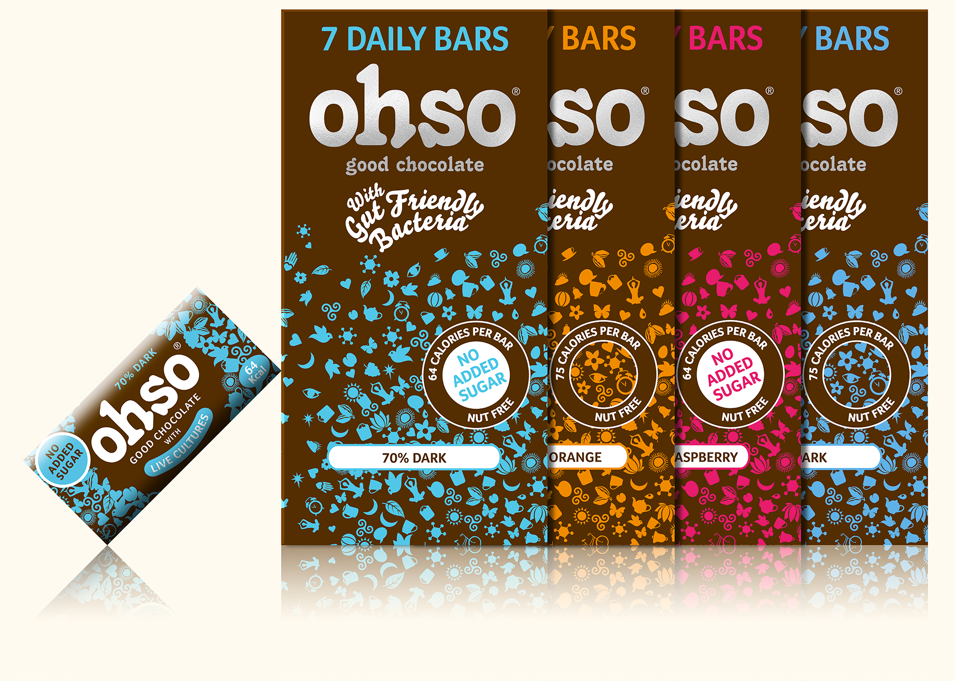
A few products I’ve designed packaging for: Marco coffee machines, Ohso Chocolate, Velair Hand-dryers, Fig loo roll, FMCG coffee, tea, snacks and sweet packets.
Standard pack designs often come in from China as a cheap starting point for clients, with basic design. It’s the designer’s job to create the brand artwork from it – or scratch - including any photography, product features, ingredients, regulations, logos, brand guidelines, colours, fonts and spacing.
Designing a stunning product pack worthy of its place on the shelf. Good enough to stop shoppers in their tracks.
Apply your maths when you’re working out angles, dimensions and accurate fit for tabs on the cutter guide.
What’s a cutter guide?
A cutter guide - or die line - is a 2D (line) drawing showing how a 3D package will be folded, cut and perforated when it pops to life. To help printers I mark-up final artwork with PINK for cuts and YELLOW for folds.
Make allowances for the must-have’s
Depending on the product, pack artwork may have to incorporate technical and regulatory detail. Which must be clear and precise. Without detracting from the box appeal. Electrical items like hand dryers require electrical information, power input/output, product photography and branding. FMCG goods often need ingredients, weight, bar code, calorie table, nutritional info. All in accordance with brand guidelines and remembering the shelf facing side remains the best side.
In my experience retail products always have more scope for design prowess whereas wholesale product packs can be slightly more basic and technical.
Tips for Tabs
Another tip, if a box lid opens either towards the front or front to back, make sure the tab doesn’t interfere with the artwork, image or wording, so it flows interrupted across the box and images match up perfectly from end to end. And when the box is taped shut, ensure text or images aren’t interrupted along the seam edge. Butting up seamlessly, edge to edge, so images run over the join when it shuts.
“Pack design is challenging work, it can be arduous and technical which is why lots of inexperienced designers shy away from it, but I love it. It’s great to see the finished item on the shelf. Incredibly satisfying. Especially when they’re edible!”
Graham
Box art for Fig Products


